AI Logo Maker & Logo Creator
- 4.6
- Rating
- 10.00M
- Installs
- Free
- Price
 Analysis by App-foxy
I first approached Logo Maker & Logo Creator as a quick way to produce a usable visual identity without opening a desktop design program. That is still where it makes the most sense to me. It is a free photography app from Maxlabs Graphic Design Tools, but its practical purpose is closer to a compact branding workshop: choose a starting idea, adjust it, add visual details, and export something suitable for a small project.
The app is aimed at people who need a logo but do not want to learn professional design software. A new online seller, a club organizer, a streamer, a local service provider, or someone preparing a social profile can get value from that approach. I would not treat it as a replacement for a designer or a full vector editor, but I found it useful when speed, convenience, and a broad choice of starting points mattered more than complete creative control.
How the current version feels in everyday use
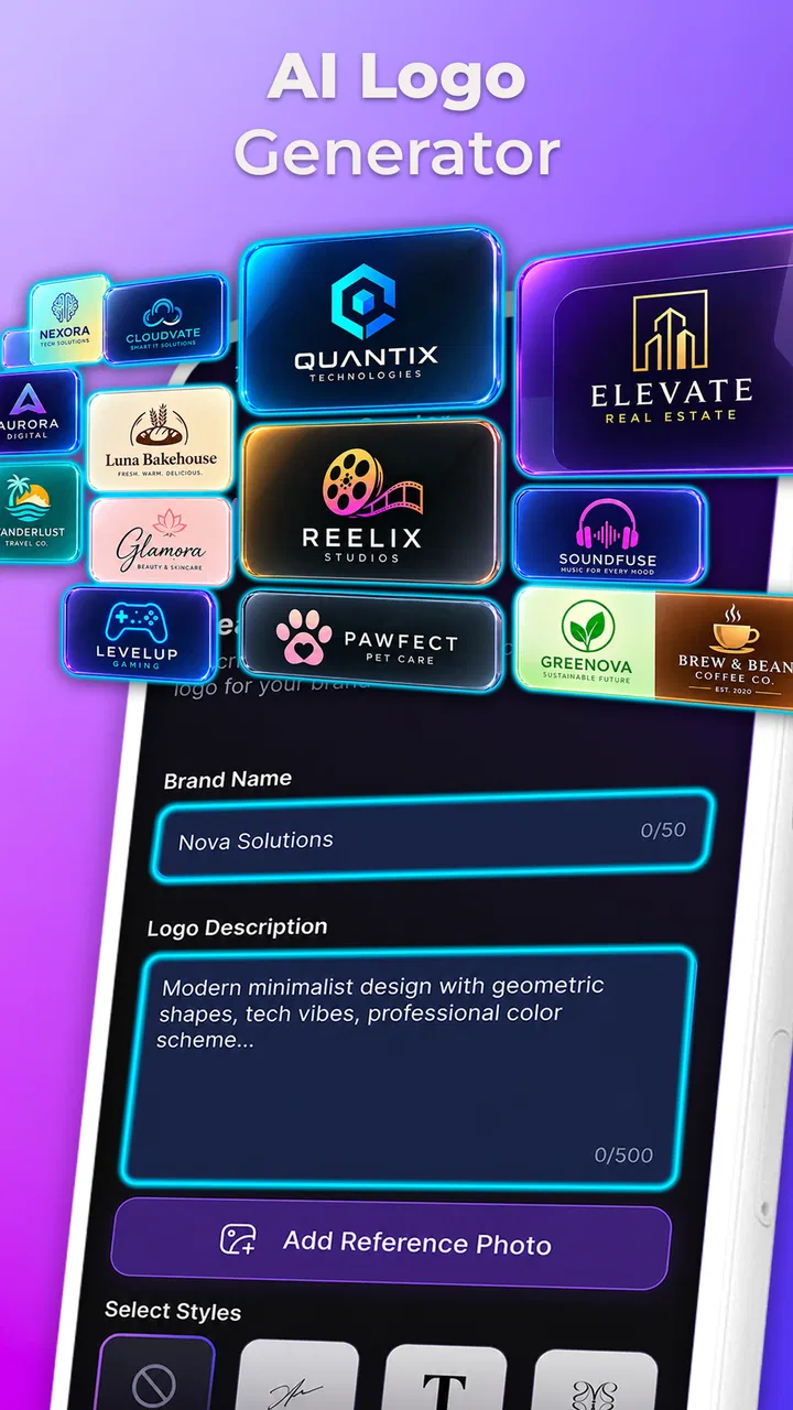
The main attraction is the large collection of logo ideas. The app presents more than three thousand templates alongside photos, filters, emojis, effects, and themed design elements. That variety is helpful at the beginning, especially when I know the subject of a logo but have no clear visual direction. Instead of staring at a blank canvas, I can browse styles and identify a shape, arrangement, or color mood worth developing.
You May Also Like

 Google Keep - Notes and lists
Google Keep’s Quiet Growth Shows the Appeal of Simpler Notes
As mobile work gets busier, Google Keep keeps winning a simple contest: capture a thought quickly, find it later, and get on with the day.

 Blood Strike: 2.5 Anniversary
Blood Strike’s Loadouts Turn Every Drop Into a Tactical Gamble
A close look at Blood Strike’s custom loadouts: how fast access to signature weapons reshapes its battle royale rhythm, rewards preparation, and narrows the gap between fights.

 Pandora - Music & Podcasts
Pandora’s Music Is Easy to Start, but Harder to Recover
Pandora’s strength is its low-effort path from a seed to a station. Its weak spot is how much confidence it asks you to place in connection, setup, and quiet recovery.

 8 Ball Pool
 Is Built on Rivalries, Rematches, and Routine
A close look at the rivalries, rematches, shared routines, and unanswered safety questions that turn a quick pool match into a persistent mobile community.

 Samsung Music
’s Quiet Strength Is Playing What You Already Own
Its reach comes less from spectacle than from dependable access to a personal library. That simplicity is both the app’s strongest retention engine and its ceiling.

 AccuWeather: Weather Radar
AccuWeather Review: A Quick, Clear Forecast for Everyday Decisions
For everyday plans, the best forecast is the one you can understand quickly. AccuWeather makes rain timing, radar, and local conditions easy to act on, with a few trade-offs.
More From Our News Desk



That convenience comes with an important distinction: a template is a starting point, not automatically a finished brand mark. The first design I choose may look attractive in isolation but feel too familiar once placed beside other template-based logos. I get better results when I use the template to study the layout, then change the wording, colors, decorative elements, and overall balance enough to make the result fit the intended project.
The workflow is particularly comfortable for quick social graphics. For example, imagine I am helping a friend launch a weekend baking page. I can search visually for food-related ideas, select a compact arrangement, replace the sample wording with the page name, and test a few color combinations. The important benefit is not that the app magically creates a perfect identity; it is that it reduces the intimidating first step and lets me compare several directions in one sitting.
I also like that the app sits between a logo generator and a simple image editor. The inclusion of filters and effects means I can push a design toward a particular mood, while emojis and decorative assets make it easier to create something playful. That is useful for informal projects, although I would be more restrained with effects when designing for a business that needs to look clear at small sizes.
Finding a useful starting point instead of browsing endlessly
The template library can be both the strongest feature and the biggest source of distraction. When there are many visual options, it is easy to keep scrolling without making progress. My practical advice is to decide on three things before opening the editor: the subject, the audience, and the desired personality. A serious consulting mark, a cheerful gaming identity, and a handmade craft label should not begin from the same visual language.
I also recommend testing the name early. A design that looks balanced with placeholder text may become crowded when the real name is longer. This is one of the less obvious traps in template-based creation. I prefer to replace the sample wording before spending time on effects, because typography and spacing usually determine whether the logo feels intentional.
Another useful habit is to make a deliberately plain version first. I remove unnecessary decoration, check whether the central symbol and wording still communicate the idea, and only then add personality. This helps reveal whether the logo works because of its structure or merely because the template contains attention-grabbing effects.
What the editing tools are good at
For casual users, the editing experience is approachable. The app is designed around visual choices rather than technical terminology, so I can experiment without needing to understand advanced design concepts. That makes it a good fit for a first logo, a temporary campaign identity, or a personal project where the goal is to look polished quickly.
The built-in photos and visual effects broaden the app beyond strict logo work. I can use them when preparing a branded post or a promotional image that needs to match the logo’s mood. Still, I would avoid treating every available effect as an improvement. Filters can reduce contrast, emojis can make a mark feel less professional, and decorative layers can compete with the name. The app gives me options, but it does not replace the judgment needed to decide when to stop.
One workflow I found especially practical is to create a small family of related graphics rather than one isolated logo. I begin with the main mark, keep its key colors and visual idea consistent, and then make a simpler variation for a profile image or narrow space. This is more useful than endlessly polishing one complex composition, because logos are often seen in different contexts and at different sizes.
Users should also think about legibility before choosing a final effect. A design can look impressive on a phone screen while losing its identity when reduced to a small avatar. I check the mark at a smaller viewing size and temporarily ignore decorative details. If the name or symbol disappears, I return to a simpler arrangement. That is a design decision the app makes possible, but the user has to carry out.
Who will get the most from it
I would recommend this app to someone who needs a presentable result quickly and is comfortable refining a visual starting point. It is especially suitable for small personal brands, social accounts, student activities, informal communities, and early-stage ideas that may change later. The free entry point makes it easy to explore before deciding whether the available tools fit a longer project.
It is also useful for people who do not have a strong visual vocabulary yet. Browsing themed templates can teach basic lessons about composition: how a symbol sits beside text, how much empty space a mark needs, and how color changes the feeling of an otherwise similar design. In that sense, the app can be a gentle introduction to branding rather than only a shortcut.
The Everyone content rating makes its audience broad, and I can see why. The interface and subject matter are accessible to general users rather than aimed at a narrow professional group. That does not mean every output will suit every purpose, though. A child, student, or hobbyist can make something enjoyable, while a company preparing a long-term identity may eventually need more precise tools and a custom design process.
Where a different tool is the better choice
I would skip this app if I needed a logo built from fully custom vector paths, exact brand specifications, or a carefully managed identity system. A dedicated vector editor is a better choice when precise geometry, scalable artwork, reusable components, and detailed typography are central to the job. Those tools take longer to learn, but they offer control that a template-focused mobile workflow cannot match.
I would also hesitate to use it as the final stage for a client project where originality and ownership need close attention. Template-based work can be perfectly appropriate for a small launch, but it can also produce a familiar-looking result. Before adopting a design commercially, I would search visually similar marks, review the template elements carefully, and consider whether the result is distinctive enough for the intended audience.
Compared with a general photo editor, this app is more focused at the starting point. A photo editor may offer stronger image correction or layer control, but it often leaves the user to construct the logo from scratch. Compared with an online branding service, this app feels more immediate and hands-on, though it may provide less strategic guidance around naming, brand systems, and consistency across many assets.
What has changed and what that means for established users
The current version is 5.2.2, and the app was released on February 13, 2019. That history matters because this is not a brand-new experiment; it has had time to develop into a recognizable mobile design tool. I see the current release as a mature continuation of the template-and-editor approach rather than a complete change of direction.
For someone who has used earlier versions, the most meaningful expectation is continuity. Existing users can approach the current build as the same kind of quick logo workspace, with a broad library and accessible editing at its center. I would still review older projects after updating, especially if a design is important, because any creative app can present familiar tools or layouts differently as it evolves. Keeping an exported copy of finished work is sensible regardless of the application.
New users should not judge the app solely by its large library. The more valuable improvement over time is the ability to turn that quantity into a repeatable workflow: choose a direction, simplify it, verify the wording, and prepare versions for the places where the logo will appear. The app can support that process, but the quality of the result depends heavily on how deliberately I use it.
The app has a 4.5 average from around 158 thousand ratings, with more than ten million installs and roughly 2.2 thousand written reviews. Those figures suggest that it has reached a substantial audience, but popularity should not be confused with suitability for every design task. I read that level of adoption as reassurance that the concept is useful to many people, not as proof that it offers professional-level control.
Costs, platform expectations, and practical trade-offs
The app is free to install, which makes experimentation low-risk. It also includes in-app purchases ranging from $0.99 to $39.99 per item. I would begin by building a complete sample with the free experience before spending anything. That lets me discover whether the available templates and editing controls are enough for my project, rather than paying based on the promise of a particular visual style.
The minimum operating system requirement is Android 7.0, so users on relatively old Android devices may still be able to try it. I would nevertheless pay attention to how comfortably the editor runs on the specific phone or tablet being used. Designing involves repeated adjustments, and a cramped display or sluggish interaction can make a simple task feel unnecessarily frustrating.
One question many users have is whether the app is suitable for a real business. My answer is conditional. It can be a sensible way to create an early logo for testing a business idea, preparing a social page, or making a temporary identity. I would be more cautious if the logo will represent a company for years, appear on packaging, or need to work across print, signage, and multiple digital formats. In those cases, I would use this app for exploration and then move to a more controlled design process.
Another practical question is whether a beginner can make something good without design experience. Yes, but the best results come from editing with restraint. I would choose one main symbol, keep the wording readable, limit the number of competing effects, and compare a colorful version with a simpler one. The app lowers the technical barrier; it does not remove the need for visual decisions.
Remaining gaps I noticed while reviewing the workflow
The biggest limitation is the tension between abundance and originality. A large template library helps me get started, but it can encourage a “pick and decorate” approach. If I accept the first attractive option, the result may look finished without feeling personal. The app would be stronger for demanding users if the workflow made the reasoning behind layout, spacing, and brand consistency more explicit.
There is also a difference between making a logo and managing a brand. A logo is only one part of a visual identity. Businesses may need consistent colors, typography, social banners, product labels, and alternate marks. This app can help generate related visual material, but I would not expect it to organize an entire identity system with the discipline of a dedicated brand tool.
The emphasis on photos, filters, emojis, and effects is a strength for expressive designs, yet it can pull users away from the qualities that make logos durable: simplicity, recognition, and clarity. I found that the app rewards a user who treats those additions as optional ingredients instead of mandatory decoration. That is an important trade-off for anyone choosing it over a more minimal logo creator.
I would also avoid assuming that a design that looks good in the editor is ready for every output. Before publishing, I check the wording, inspect the edges of the composition, view it against light and dark backgrounds, and test a small version. If the intended use includes printing or professional production, I would confirm that the resulting file and visual treatment meet those requirements before committing to it.
What I would watch as the app continues to evolve
For future updates, I would be most interested in improvements that help users move from templates to more distinctive results. Better guidance for simplifying a design, clearer ways to create coordinated variations, and stronger support for checking small-size legibility would have more lasting value to me than simply adding more decorative assets.
I would also watch how the balance between free tools and paid items develops. The free experience is important because it lets beginners learn the workflow, while paid options can make sense for users who need specific styles or more advanced resources. The fairest arrangement, in my view, is one that allows a person to understand the practical value of an item before purchasing it.
My advice to a first-time user is straightforward: start with a clear purpose, replace placeholder text immediately, make a plain version before adding effects, and save a few alternatives rather than becoming attached to the first attractive template. Those steps turn the app from a browsing exercise into a useful design process.
After using it as a quick branding tool, I see Logo Maker & Logo Creator as a strong option for accessible, mobile-first logo experiments. It is free to begin, broad enough for many informal projects, and approachable for people who would otherwise feel lost in a professional editor. Its limits appear when originality, precision, and long-term brand consistency become more important than speed.
I would recommend it to a friend launching a small project, testing a business idea, or creating a polished identity for a social page. I would not recommend relying on it alone for a demanding corporate identity or production-ready design system. Used with that distinction in mind, it does its job well: it helps turn a vague idea into a visual direction, while leaving the final judgment—and the responsibility for making the result genuinely suitable—to me.
FAQs for AI Logo Maker & Logo Creator
01What features does the Logo Maker & Logo Creator app offer?
The Logo Maker & Logo Creator app provides a wide range of features including customizable templates, a variety of fonts, and an extensive library of icons and graphics. Users can easily create a professional-looking logo with drag-and-drop functionality, color palettes, and the ability to save and edit projects at any time.
02Is Logo Maker & Logo Creator suitable for beginners?
Yes, Logo Maker & Logo Creator is designed with beginners in mind. The app features an intuitive interface that guides users through the logo creation process step-by-step. With easy-to-use tools and templates, even those with no design experience can create impressive logos quickly.
03Can I use the logos created with the app for commercial purposes?
Logos created with the Logo Maker & Logo Creator app can generally be used for commercial purposes. However, it’s important to check the app’s licensing terms to ensure compliance, especially when using specific fonts or graphics that may have restrictions on commercial use.
04Does the app support vector file exports?
Yes, the Logo Maker & Logo Creator app supports exporting logos in various formats, including vector files such as SVG. This feature ensures that your logo can be resized without losing quality, making it ideal for professional printing and scaling purposes.
05Are there any in-app purchases or subscriptions required?
While the Logo Maker & Logo Creator app offers a range of free features, it also includes premium options available through in-app purchases or subscriptions. These may unlock additional templates, fonts, and graphics, providing users with a broader array of design tools to enhance their logos.
Pros
- User-friendly interface for quick design.
- Wide variety of templates available.
- High-quality export options.
- Supports custom fonts and colors.
- Affordable premium features.
Cons
- Limited free template selection.
- Some features require in-app purchases.
- Occasional app crashes reported.
- No offline mode available.
- Ads can be intrusive in free version.

AI Logo Maker & Logo Creator
Gallery